


Fall is here, which means its family photo time! I know several of our ambassadors are busy, busy with their family photo sessions, but thankfully they did make time to share a little bit of their advice with us when it comes to picking out what to wear for your next family photo session.
Below we’ve shared four color schemes that you can’t go wrong with this fall PLUS our ambassadors have thrown in a few tips for you when it comes to putting it all together.
#1 – Jewel Tones
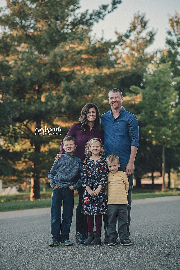

Emily of Everbranch Photography says,
I love the rich tones of the mustard, navy, and maroons with the muted greens, browns and golds of fall. A mix of textures and patterns creates interest without getting too crazy. When picking colors for family photos, pick colors you like and that you feel comfortable in. These colors will be on your walls (hopefully!), so they go with your style and decor.
#2 – Rich Color + Neutrals
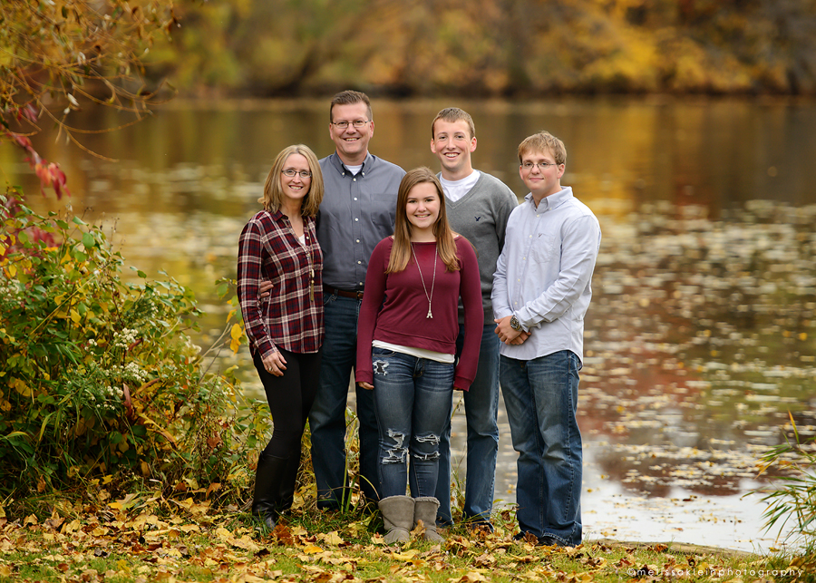

Melissa of Melissa Klein Photography says,
I photograph a lot of families in the fall, and they always ask me the same thing – “what should we wear?”. When answering this question, I like to take into account the time of year and the location of the photos. For fall photos, there are typically a lot of rich colors in the locations I choose (reds, golds, browns and some green). I tell my clients that darker jewel tones look great for fall photos, along with grey and a little bit of white/cream mixed in. I have them avoid bright colors if possible, and avoid a lot of patterns. In general, sticking to two or three colors and working those into the outfits works best. If you’re going to add some patterns in the mix, make sure it’s only one or two people, and make sure the patterns are accentuated by the colors that other family members are wearing. Also in the fall – layers look great, so accessorize and layer up! Adding or removing layers is a great way to get several different looks from one session.
#3 – Maroon, Mustard Yellow and Navy
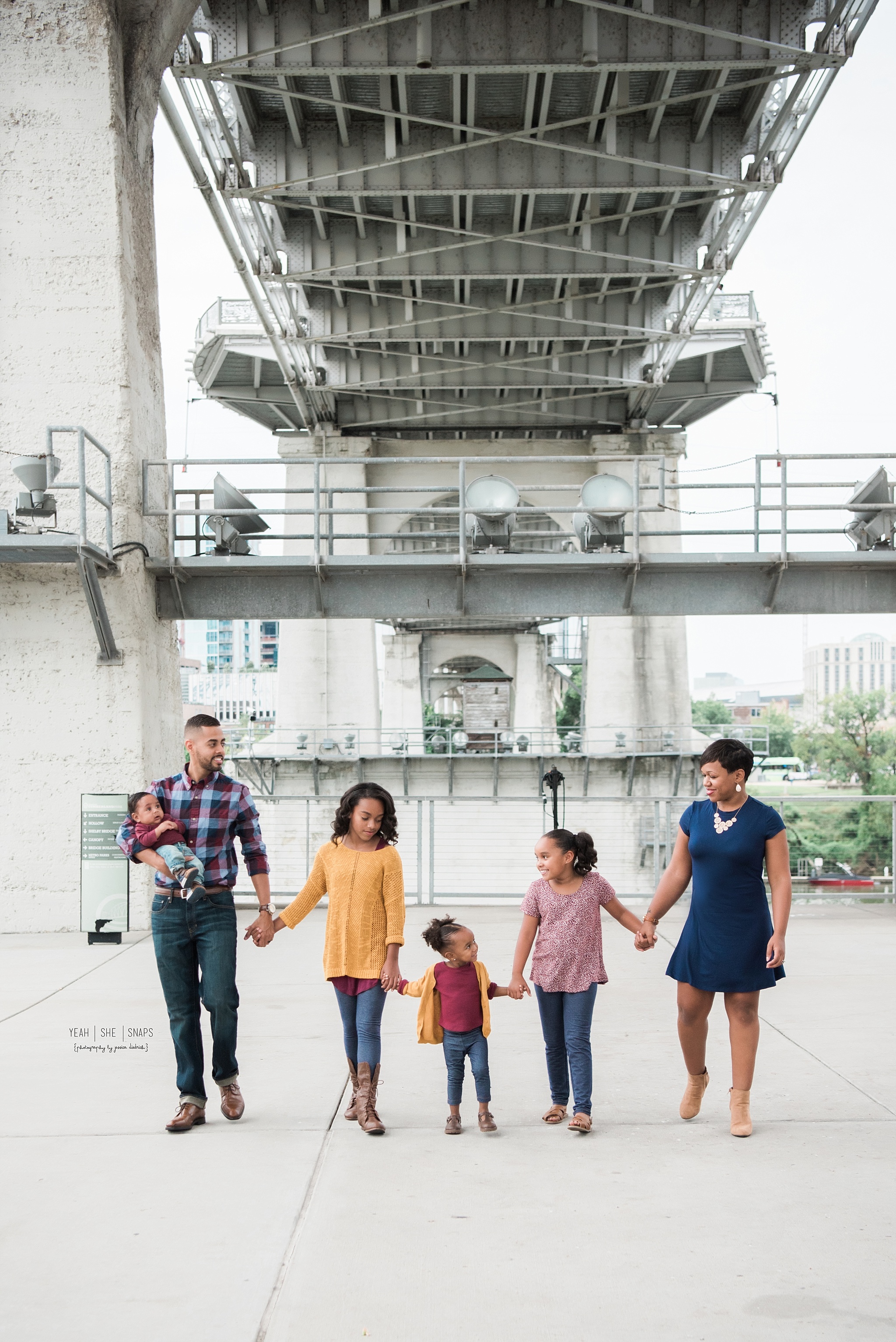

Jessica of Yeah She Snaps Photography says,
I absolutely love the use of mustard yellow along with rich, jewel-toned colors for fall! Even when not combined with the typical burnt orange, it makes for the prettiest palette. This super chic family wore just the right amount of mustard mixed with maroon and navy, and the results were fantastic for their downtown Nashville shoot. Don’t be scared to throw a cute print in the mix with mostly solids to keep things interesting, yet not distracting. Mama has such a great sense of style and we had the best time!
#4 – Complementary Colors : Blue + Orange
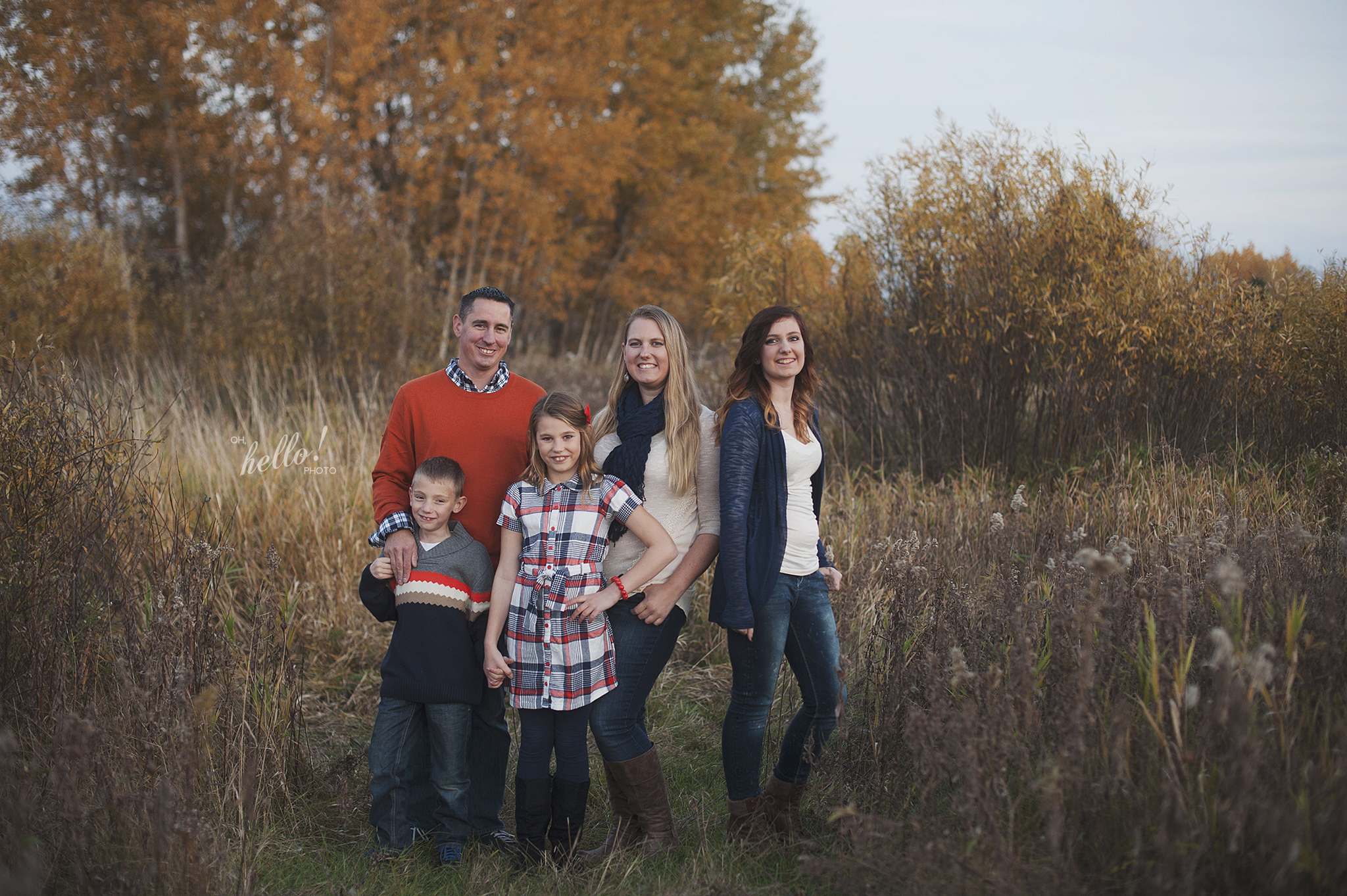

Kimi of Oh Hello Photo says,
I love this color scheme for fall! Orange and blue are opposites on the color wheel which makes them pop against each other. Pairing that with tans and grays pull it all together while bringing out the gorgeous fall colors.
In addition to the ideas above you can also have a look at the bluebird chic family photography pinboard for more wardrobe ideas for your family photos.
***
Hey photographers don’t let your clients be the only ones dressed to impress! Below are three bluebird chic straps we think just might be the perfect fit for your fall sessions.


Leave a Reply